Sunday 30 November 2014

Visual Critique Image


I have decided to study this particular image by Steven Klein to focus my visual critique essay around. The image is from a 2003 beauty editorial shot for Vogue Italia. Out of all of the images I have looked at I felt that this one was the one in which I was most interested in due to its futuristic aura and the way in which it appeared to tell a story with its strong sense of narrative.

Steven Klein

After looking into more photographers surrounding the visual critique essay, I came across photographer Steven Klein. I was immediately intrigued by his unusual style of fashion photography and how his work continually seemed to all have a strong narrative and sense of storytelling throughout.

Saturday 29 November 2014

The next big thing - Iris van Herpen

When researching brands that represented a unique and fashion forward approach to their work I was immediately struck by designer Iris van Herpen and her use of 3D printing. Her product designs are completely far fetched yet beautifully sculptured surrounding the theme of motion and movement. Her use of 3D printing has a uniqueness to it that had not been presented into the industry prior to her designs. As well as 3D printing the designer has also worked with injection molding, laser cutting and intricate architectural handwork on a variety of garments to which give them a three dimensional and voluminous look.  I feel that her use of boldly sculptured shapes that accentuate the form of body shape are amazing at showing just how far fabrics can be taken if done so in the right way.

Celine

Following on from my brand research behind Celine I decided to experiment with mood board compositions by mixing both imagery from their brand and from my colour palette theme, aswell as adding in key words to which I feel represent the brand itself.

Progress of Brand interpretation of Colour Trend Mood board - Celine

To get a better understanding of the layout and imagery that I want to include on my brand interpretation mood board for Celine I decided to look into different areas of the brand.

Brand Identity
When looking into Celine's brand identity I knew that I wanted to focus on their famous bags as I feel that this is the way in which the brand is mostly identified through, aswell as their crisp white box packaging and fun yet fashionable logo t-shirts.

In store experience
For Celine's in store experience imagery I wanted to focus on their clean, streamline shopping experience to which everything is placed to perfect precision.

Online experience
The way in which Celine promotes itself online is through the use of social media pages- Facebook, Twitter and Instagram, as well has having an online website to which allows you to most importantly shop, but also to look at their current and past campaigns for their different seasonal collections, as well as showcasing fashion videos to which explain the representation that Celine upholds as a brand from the past and present. You can also look into their most desired designer Phoebe Philo.

Advertising
For the advertising section I decided to focus on their campaign work, celebrity consumers and fashion films from their online website.

Events
I decided to focus on their catwalk collections and trade show exhibitions as the main factors of the events they hold for the brand.

After putting the imagery from Celine into individual sub-categories I decided to select some images from each section and put them together in one document to portray Celine as a whole brand.

I feel that this activity was useful as it helped me to gain more knowledge of the brand itself and the way in which they portray their brand through the media.

#FCPreflection

Friday 28 November 2014

Fashion does more damage than good

This week we were tasked with a debate surrounding the topic of 'Fashion does more damage than good'. My group were supporting the topic as we were 'for the consumer'. We decided to look into the main topic of Body Image yet with the following sub categories; Weight and eating disorders, Photoshop and image manipulation, Race, the objectification of women and self absorption.

I feel that fashion has a negative effect on the consumer as they present the idea of an unrealistic lifestyle through the use of over edited images and the objectification of women within the media. 
Photoshopping: 
As a consumer, we are exposed to 5,000 airbrushed images a week.
The Advertising Standards Authority (ASA) monitor every advertisement published for the British public, although there are no defined laws as to what the magazines can post, but the images must be realistic.These enhanced images psychologically alter the way that influenced young people perceive their bodies to be. Eating disorders, extreme exercising and even depression can be linked as a correlation as factors between the enhanced images and problems. As most supermodels are a US size 0 or a UK size 4 – sizes which are not natural for most women- they would feel pressure to change to look the same. Negative thoughts about their body would rise and dissatisfaction for the way they look.

Weight and Eating disorders:
The industries version of ‘plus size’ is a lot slimmer than what it is in real life- they are calling a size 12-14 plus size, when realistically this is a healthy weight for women. Brazilian model Anna Carolina who worked for brands such as Giorgio Armani and Dior died aged 22 from anorexia and Anna Reston died of an eating disorder-she weighed only 88 pounds yet at a casting call she was called fat. The impact of this imaginary plus size is influencing all ages to believe they’re too big to be pretty or famous.

Race:
The representation of ethnic minorities within the industry is so poor, it is not a true representation of the society that we live in today. It is creating stereotypical views which are then perceived by many consumers that this is 'ok'. When black models are rarely represented in the industry they are made to stick out like a sore thumb and treated as 'token' models in catwalk shows. An issue of Italian Vogue stated that "that's enough to get media of their backs, they've 'done their bit" by having black models in their campaigns or runway shows. Rick Owens has tried to embrace racial and body image but has ended up producing an SS14 show portraying models of ethnic minority in animalistic ways.Thirteen out of 92 shows at the most recent New York fashion week featured no black models at all. These statistics show diversity in fashion to be sliding back rather than improving. Season after season a substantial number of design houses use little to no models of colour. No matter the intention, the result is racism.

Sexual objectification:
Women are often shown as an object through the fashion media, an example being this photo of Miley Cyrus taken by fashion photographer Terry Richardson. Once a child star, “Hannah Montana”, her fan base was millions of youngsters. Her new image leaves little to the imagination and is plastered all over the internet and magazines, making her young fan base believe it’s acceptable to objectify themselves. A woman so dominant in the current fashion industry should not be allowed to promote this. I showed 30 people these photos and asked their opinions of them, 57% of people said that they were “disappointed in Miley Cyrus” and this is because she once was a role model to a young audience. The rest said that this photo made them feel “self conscious”. When asked how the “Blurred Lines” video represents the women in it, people replied the women were represented “as an object”, “vunerable”, “degraded” and “as sex objects”, 96% of people who answered my survey had seen a “photo in the media that shows women as a sexual object.” Which is completely unacceptable.

Self absorption:
Lighthearted films such as Mean girls and in-depth books such as 'The Hundred Dresses' highlight the issues of bullying and of being ostracized due to not wearing the right thing. Terms the media uses such as "must have" and "ultimate" imply that if you do not have this, you are not one of the fashion crowd. They influence the consumer into buying to ensure that they fit in with these high levels of social pressures that society sets. Whilst this social shaming is set out more in females, men are still affected. Children are widely affected by this too, having to have those 'kickers', or that 'Nike bag'. In schools in the US, designer clothing affords some Children "the opportunity to become popular and that protects you and gives you social power and leverage over others" according to a Study by Professor Dorothy Espelage, University of Illinois.

Therefore I feel that each of these points proves that “Fashion does more damage than good”. Instead of encouraging diversity and individuality, Fashion promotes conformity and an unrealistic self-image.

The return of Black Friday..

Black Friday is back once again and stores are going into overdrive. Sales with items that are up to 70% off are having consumers go into a shopping frenzy. Online shopping has been cursed with the crashing of websites (shock) as people pile in to make the most of the deals ahead of Christmas, online websites such as Topshop, ASOS, River Island and Curry's electronics have been overloaded with buyers which have therefore led to technical difficulties, and it's not much better for the problems going on in store; Police have been called in order to try and tame hundreds of shoppers as they fight to get the best deals, people going to extremes such as assaulting shop assistants in order to get what they want. I can't help but feel as if the whole idea surrounding Black Friday has got completely out of hand. An event that was once meant to be fun and enjoyable has now become into a war of bargain hunting.


I feel that Black Friday in the build up to Christmas dampens the spirit all together, a season that is meant to be all about togetherness has turned into a war of desperate consumers. I feel that it just goes to show the extremes that some people are going to in order to get the best deals, however yes I agree that the products being sold are of a very good price (most of the time) I also feel that it is a way of brands to take advantage of consumers by selling old stock that is not selling as well as expected. It is a typical sale's technique to which people are buying products for the sake of it..they do not necessarily need the product however due to its incredibly reduced price tag I feel that people convince themselves that it is a necessity.

http://www.dailymail.co.uk/news/article-2852585/Mayhem-Black-Friday-begins-Shoppers-clash-supermarkets-trying-grab-bargains-Boots-Game-Curry-s-PC-world-websites-crash-thousands-start-hunt-Christmas-deals.html

Thursday 27 November 2014

My personal experience with fashion of the future!

Prior to Uuniversity I took a gap year and travelled around the world for six months and can honestly say that packing was a nightmare! Trying to find everyday essentials that were going to remain somewhat clean and hygienic in a back pack was proving to be difficult. When it came to packing a towel I was unconvinced that a homely fluffy and soft towel was going to stay exactly that way as I used it daily for 6 months straight...until my friend suggested that I get a microfibre towel. Initially I did not have the slightest clue what it was, to me a towel was just a towel!

But I decided to look into it further to see if it would be a better option..

Microfibre is a synthetic fibre that is thinner than one denier!  The shape, size, and combinations of synthetic fibers are selected for specific characteristics, including softness, toughness, absorption, water repellency, electrodynamics, and filtering capabilities, because the microfibre material removes moisture/sweat away from the body, it helps to keep the product or the wearer cool and dry. This basically meaning that when I showered and used the towel it would pretty much dry my skin instantly and the towel itself would take little time to dry once used. It is safe to say that investing in a microfibre towel was the best decision for the climate I was going into and I feel that it goes to show just how fast fashion is moving forward and evolving even surrounding the most basic things. I think that over the next 30 years or so it is going to be very interesting to see just how far they can take materials and what innovative ideas designers will come up with.

Oak & Dust - sunglasses of the future

Alongside many other competitors, Oak & Dust are moving forward and getting involved with the evolvement of digital fashion through the use of 3D printing. They have designed a collection of sunglasses that are 3D printed in Polymide with a cork nose support that is milled from a 3D scan of the consumer's actual face shape. Each pair of eye-wear also come in an individually custom milled cork box that protects them from scratches or breakages.

I think that the idea of custom fitted eye wear is so clever and exciting and will help to stop the awkward motion of glasses that are too big sliding down your nose everytime you move!

Iris van Herpen - Magnetic Motion


The future of fashion - 3D printing

We are moving into a new era within the fashion industry to which is seeing man made methods of creating products such as sewing, knitting and weaving being taken out by new digital software which allows you to design and create your own products entirely digitally. 3D printing allows the consumer to become the factory with its 3D scanning technology to which is bespoke to bodyshape and allows you to create increasingly fluid and flexible shapes. As well as this, you can even create your own 3D product from the comfort of your own home with the help of a home 3D printer that costs less than £1000, this making it accessible to any consumer.

Dutch fashion designer Iris van Herpen has established herself as the pioneer of 3D printed fashion. She created a dress that Time magazine declared as one of the 50 best inventions of 2011. Her bold work with materials and stratasys make for futuristic designs which have become synonymous within the 3D printing industry. At Paris Fashion Week, Iris van Herpen showcased her latest collection of 3D printed apparel- her SS15 ready to wear collection which was titled "Magnetic Motion" that is claimed to have been inspired by the attractive and repulsive forces of magnetism.

Her designs are entirely unique and innovative, the use of soft layering mixed with bold geometric shapes make for a show stopping collection in which brings something new and exciting to the catwalk that has never been seen before.

Monday 24 November 2014

Phoebe Philo

Phoebe Philo is the Creative Director of Celine. Philo is known for her warm, likeable and desirable collections for the brand.

However she is most famous for breaking the boundaries with her Autumn 2012 catwalk show to which she was eight months pregnant and decided to not let the show be an over the top exaggerated affair, yet a small, intricate, invite only event that included only a handful of editors. Despite her taking a massive risk; one that had never been performed in the fashion industry before, it paid off and she was praised highly for her exclusive and desirable approach to launching a collection.

Philo is now known as one of the few "Rare Birds" who made it big in the fashion industry with her clever and innovative thinking to which sets her aside from all other competitors.

I feel that being a woman in the fashion industry is a lot harder than it is for men as we are expected to achieve a lot more to be able to keep up with the higher intake of males within the industry, for example CFDA only having 2 women recipients awarded in an 8 year history! However despite some feeling that this is a negative thing, I feel that it should be taken as a positive as it gives the individual the drive and determination to take risks, break boundaries and create a positive name for yourself.

http://www.theguardian.com/fashion/2014/sep/28/phoebe-philo-unveils-warm-and-immensely-likeable-celine-collection-paris-fashion-week

Kim Kardashian breaks the internet?

Last week, the world was stunned as reality TV star Kim Kardashian revealed her famous bottom and other bits glazed in oil on the front cover of PAPER magazine claiming that she 'broke the internet'..but what exactly is behind the idea of this provocative shoot?

The shoot itself was a recreation of the 1976 images known as 'The Champagne Incident' featuring black model Carolina Beamont by photographer Jean-Paul Goude.

View image on TwitterThe 'champagne' photo was part of a larger photo book titled "Jungle Fever", that fetishized Black women and sometimes made their bodies appear animalistic. Goude had a sort of obsession with Black women, which perpetuated the ideals that Black women’s bodies were objects. Author of "Venus in the Dark: Blackness and Beauty in Popular Culture," Janell Hobson notes that in one part of "Jungle Fever", Goude compares the backsides of Black women to those of "race horses".

Kim received a lot of backlash against the recreation of the image, with people stating that it was a disrespectful and distasteful recreation of what the original image stood for. So why did Jean-Paul Goude recreate it? I feel that Jean-Paul has recreated the image to bring it up to date and modernise an old image that few people knew about up until now to something that we will all be talking about for a while. Without the realise of the Kim Kardashian images, no one would have really known about the 1976 original images and what they stood for, so by recreating them Jean-Paul Goude has almost re-released the original at the same time and has managed to get people talking about what the actual idea behind the image is-this being something that as a photographer, he had a great desire and interest in..It is almost as though he has used Kim Kardashian as a way to get people talking about himself and to become more involved with his previous, more meaningful work.

Moffy - The cross-eyed model!

It seems that now, more than ever, the fashion industry are desperate to find the next big model who's going to overtake the likes of Kate Moss, Giselse Bundchen and Cara Delevigne. Yet however, rather than looking for the conventionally ridiculous good looking, long luscious locks and glowing sunkissed skin of a model it seems that agencies are looking for that certain person who has an edge and total uniqueness against any other model out there..just like Storm modelling agencies newest recruit Moffy.

Moffy had never been photographed for a magazine before her POP magazine shoot
Moffy on the cover of Pop magazine's latest issueMoffy (real name Myfanwy) is a 19 year old girl from London who has strabismus, or crossed-eyes. Up until being scouted at a festival when she was 14, Moffy had never considered modelling as she felt she wouldn't fit in. However when she was old enough to do so, she was given the choice whether to have her eye fixed or leave it as it was, a choice that she went against as she felt going through with the operation would leave her untrue to herself.

She is fast becoming one of the most lust over models with her enviably beautiful unique face and Angelina Jolie pouted lips having just appeared on the cover of popular fashion magazine, POP.

Personally I feel that it is far more interesting to see a model who takes her biggest insecurity and turns it into her biggest virtue on the front cover of a magazine as it presents a feeling of pride and celebrates the idea of uniqueness and being different to seeing stereotypically beautiful models sprawled out provocatively on a page. I feel that it allows women to be presented in a way that empowers them instead of demeaning them as an object that is to be sort after by men. Following the success of Moffy, I hope that the rest of the industry will take note and come together by scouting even more women who are uncharacteristically beautiful in their own way.

Sourced from: http://fashion.telegraph.co.uk/columns/bibby-sowray/TMG10460801/Meet-Moffy-the-cross-eyed-model.html

Body Image

Models have become noticeably thinner and thinner as the years have gone by. From a healthy UK size 6/8 in the 1990's to a shrinking UK size 2/4 also known as 'Size Zero' in the 2000's..

Where once models were seen to be a healthy and strong role model to women, they are now promoting an unhealthy, dangerous and frankly unrealistic body image towards real women that will only be achieved through extreme measures of exhausting exercising and ridiculous dieting.

"Paris Thin"
The term 'Paris Thin' was created by the former editor of Vogue Australia, Kirstie Clements. It stemmed from the idea of designers hiring models to fit into their tiny sample sized garments rather than fitting the garment around the model. This originally began in Paris as it was noted more than ever that the models were shrinking year by year to fit into these ridiculous size zero garments that should realistically fit a naturally slim 10 year old girl, let alone a 20 something year old 6ft model! No longer do we see glowing healthy sized models strutting down the runway showcasing the garment in an exciting and desirable way, but now a gaunt, run down carcass of a model drowning in material.

So what effect does this size zero trend have on young women? It has been proven that from the years of 2000-2010 the rates of depression have doubled in women and that 90% of British women feel body image anxiety with 50% of these women smoking to suppress their appetite. With us being exposed the 5000 photo shopped images a week it is hardly surprising that research has proven that the 'airbrushing culture' leads to self esteem issues supported by the fact that half of 16-21 year old's consider having cosmetic surgery on a day to day basis.

After considering all of this information I feel that until designers realise the impact that the size zero trend is having on young women, we will keep going round in a vicious circle until these sample sized models have a healthier sized garment to fit into.

Sunday 23 November 2014

Steven Meisel

For our Visual Critique brief I have decided to look into fashion photographer Steven Meisel. The reason I chose this particular photographer was because I loved the way his photographs showed a strong sense of storytelling and theatrical narratives through his use of clever styling and art direction as well as the way in which he seems to reference his work around history and culture.

When looking into his work, I found myself particularly interested in his 'Morning Beauty' shoot that he did with Lily Donaldson, Gemma Ward and Caroline Trentini. This photographic series was published in the December 2005 issue of Vogue US as 'Glamora'.

This particular spread engaged me as I loved his use of high end, luxurious and wealth driven looking models whom were styled in over the top embellished, girly gowns and sky high heels but set in an urban, almost run down area to which completely juxtaposed their styling. I feel that Meisel brought together two ends of the fashion spectrum...the luxurious old school glamour and the typically American urban street, two things that on paper should not compliment each other, yet on camera fit perfectly hand in hand.
Sourced from: http://www.fashiongonerogue.com/morning-beauty-lily-donaldson-gemma-ward-caroline-trentini-steven-meisel/

Friday 21 November 2014

Fashion Photographers

Looking into different Fashion photographers, it becomes easy to categorize them in to the style in which they photograph.

The Realists: Attitude and Voice

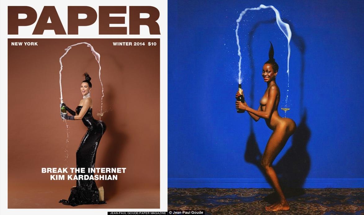
Terry Richardson..master of flash realism


Terry Richardson's style of photographing is very graphic with his expression of high attitude and sexual content. He photographs his subjects in a way that we would expect them to behave. His use of bright lights and high contrasting within his images make for a simple yet effective image which leaves the audience to focus on the subject rather than being distracted by what is surrounding them.

The Surrealists: Styling and Art Direction

Tim Walker


Tim Walker's photographs provoke the idea of a fairytale surrealism. His colour palette is generally very light and airy with pastel tones to which have an almost historic feel about them. I feel that Tim Walker brings out every adults inner child within his images as they are fun and relate back to childhood memories with his fairytale story and mythical creature references.

The Romantics: Referencing and Homage

Peter Lindbergh


Peter Lindbergh's photographs have an almost historical romanticized feel with their continual soft black and white colouring and stripped back approach with references of past eras. Lindbergh seems to focus on the story behind the models eyes, as he has them either looking directly through the camera or just off center, this creates the idea of pain and using the eyes as the main focal point to express love and lust. The eyes are usually the brightest part of his photographs, thus again reinforcing the idea that he wants the audience to immediately be drawn and focus on what emotion the subjects eyes are provoking.

The Colourists - Colour and Tone

Mert and Marcus


Mert and Marcus's photographic work is very much based around the idea of clashing colour. They have an abstract compositional feel with a poster pop and hyper real pantone colour palette which gives out a very fun and cartoon/felt tip like aura.

The Storytellers - Narrative and Story

Mario Testino


The narrative behind Mario Testino's work assumes the idea of the allure of celebrity. This is interpreted through his use of clean, glossy images as well as showcasing celebrity culture through the famous icons and models that he photographs. His photographs alert the idea of the classic codes and aspirations of luxury yet with a post modern twist.

The Animators - Choreography and Movement

Martin Munkacsi


His work portrays the idea of althletic choreography through the use of the lighting and form of natural motion throughout his images. He references action, sport and event through his photography as his work looks entirely natural, non posed and fun! The use of natural lighting and strong tonal composition helped to give the desired effect of a naturally formed photograph.

Wednesday 19 November 2014

Liberty of London

"I was determined not to follow existing fashion but to create new ones"
- Arthur Liberty

Episode 1 of the second season of Liberty of London followed managing director Ed Burstell and his fellow 400 co-workers as they pulled together to re-vam
p the store in time for the Christmas season. Burstell was brought in to modernize Liberty, and so that he did. With his 'open call' to which saw 800 entrepreneurs que down the street purely to get the chance to pitch in front of Ed and his team for a mere 3 minutes in hope of being 1 of the 12 people picked for a chance to have their concepts sold in store. Out of the 800 hopefuls we only followed one success, Essex girl Nancy who had qued since 4am the previous morning in hope to pitch 'Nancy's Nails'; a scented nail varnish top coat. Other hopefuls included Richard and Sal with their £185 "doggy jacket" which never made it past the pop up shop..

The episode followed team members from all of the different departments within the store as they worked to keep Liberty's timeless and aura of wealth but also adding in a sense of youth and the modern world.

Quirky and eccentric stylist Omar was in charge of pulling the most extravagant yet elegant looks for both customers and the styling team to which they would then photograph and Instagram in the hope of appealing to the 'fresh shopper'.

Head of Identity, Liv Silvester worked to design a 'Summer of sports' window display following the themes of swimming, cricket and gymnastics which would be used to showcase the products in an innovative way...something that did not sit well with Managing Director Ed Burstell. However despite this failure, Liv then worked with a team until 5am, 2 hours before the store was due to open, on rearranging the 'Scarf Hall' in order to try and get the falling sales of Liberty's most prestigious and identifiable product; the hand crafted silk scarfs, back to where they were when the store first began. The end result was a concoction of bold, vibrant, eye catching prints swallowing the room and taking you into an almost exotic climate as scarfs loosely draped around mannequins in an angelic manor, yet the help of the 'bondage' like Liberty embellished straps harnessing the mannequins helped to add a more modern edge by grabbing the consumers attention with its controversially sexual display with its "drama and motion".

The final way in which we saw the rejuvenating of the store was with the help of American singer/ Songwriter Pharrell Williams and his uni-sex fragrance collaboration with the brand, to which saw the store transform from "no longer being a grandma's store" to "cutting edge and cool".

Overall, the programme itself gave a great insight in to both the store itself and what goes on behind the scenes, it showed us as the consumers that the team behind the brand care just as much about the aura that the store is giving off as well as the care that they have for both their old and new consumers. The documentary definitely helped the brand to become more personable to the consumer as I feel, we are allowed in to follow their journey of transformation.

Sourced from: http://www.channel4.com/programmes/liberty-of-london/on-demand/5
9751-001

Tuesday 18 November 2014

Horst - Photographer of Style

The Horst Exhibition - The Victoria and Albert Museum, South Kensington, London


Glamour Vs. Grunge

Looking at trends from the past 10 years or so it is clear to see how a woman's idea of a day to day attire has evolved. The cutesy floral print has been replaced with block monochrome colours. Pale denim jeans are now ravenously ripped black jeans and delicate dolly shoes are now chunky black boots or trainers.

Aside from looking at previous trends from brands, looking into celebrities and looking at how their style has changed over the last few years also helps to advertise the idea of the transformation from the cute girl next door to the edgy grunge girl aswell as a mixture of the two inbetween.

Pixie Lott (Singer/ Songwriter)- Transformation from cutesy girly girl style when she made it big in 2010 to fashion vixen and risk taker in 2014.


Whitney Port (Former Reality TV star and Designer)- From Californian Barbie doll reality TV star to catching her big break in The Big Apple and becoming one of the hottest young designers with her quirky, masculine sculptured style. (2007-2014)


Fashion inspired by '70's Glam'

Fashion is constantly evolving whilst also constantly rejuvenating and modernizing styles and themes from previous eras. Fashion film and culture have played a huge role within the creation of new trends. Without previous trends and styles to fall back on where would these new ideas come from?


The 2013 film American Film 'American Hustle' is set in New Jersey and is loosely based on the FBI ABSCAM operation of the late 1970s and early 1980s. The film itself shows the male characters dressed in bright and vibrant two piece suits as well having the women in sultry and seductive silk gowns whilst channeling Marilyn Monroe through her iconic ice blonde curled hair and pouty red lips.

Following the films release and great success, the Fashion world began to see a new potential trend- The 70's. Stores went into overdrive with over the top dresses and jewels for the women, and extremely formative yet over the top suits for men. metallic dress ralph lauren 70s Glam: Fashion Inspired by American Hustle Film

This trend continued throughout 2013 before fading out before it reached the New Year. The idea behind using traditional Fashion film and then transforming it into a copycat Hollywood Movie aswell as creating new trends surrounding the style is a way of both adding culture as well as educating people into a world of fashion that they may have never known about before hand. Although we may not realise it at first, famous fashion film icons from the 1900's are continually influencing the fashion industry on a day to day basis which is something that I find really intriguing and interesting to see how it can be modernized to fit in with a whole new decade yet still remain timeless.

Sourced from: http://www.fashiongonerogue.com/american-hustle-70s-fashion-film/

Sunday 16 November 2014

Femininity VS. Masculinity

Walking through the streets of Nottingham on a daily basis, I can't help but notice the way in which women seem to be dressing in a much more relaxed and masculine style than ever before. Where women were once seen to dress in a way that was seen to allure and attract male attention, we see that the two genders now appear to be morphing into one another.


Demure embellished pastel coloured knitwear and elegant kitten heels have been replaced with harsh block monochrome oversized swapping jumpers and chunky trainers. In a year the fashion world seems to have moved into an era in which sees women dressing in a way that gives them a dominant edge towards males instead of watching them fade into the background in a stereotypically 'cute' and 'girly' style.


When exactly did light denim jeans paired with a cream fur jacket and tan dolly shoes evolve into black ripped jeans paired with an oversized duster coat and slouchy black boots? At which point did the fine line between mens and womenswear become so blurred to which women could step out in a males t-shirt or jumper and not even be given a second glance? The reality that women are now, more than ever pushing fashion boundaries and dressing how they wish and not how they are expected shows how by forcing a stereotype to a gender makes them want to rebel in the opposing direction to prove their dominance.

Realising that this gender style reversal related to how my style has seemingly evolved over this last year has made me want to look into the idea of feminity vs masculinity a lot f

Thursday 13 November 2014

The fashion system


1. Literal representation
The campaign is entirely presented in a way that promotes the brands products in a lookbook type format that clearly showcases the products first hand without adding a deeper meaning.

2. Romanticized

The campaign tells a story; it lets the consumer try and find a connection/create a story surrounding the men in the image. Romantism does not only focus on the relationship between a male and female, it surrounds the idea of presenting a real life relationship to create a more personable feel towards the consumer.

3. Mockery

Photographer Tim Walker creates a completely absurd and surreal situation using the theme of Alice in Wonderland as the inspiration. Both the styling and the clever camera angles allow the models to look un-proportioned in a way that juxtaposes the real life setting to which would have been seen through the photographers lens. The use of these clever areas surrounding the mise-en-scene create an entirely barbaric yet fascinating image that relates back to a childhood story.